...

By Alice Gibbs
Senior Reporter
0
Share
Newsweek is a Trust Project member
See more of our trusted coverage when you search.Prefer Newsweek on Googleto see more of our trusted coverage when you search.
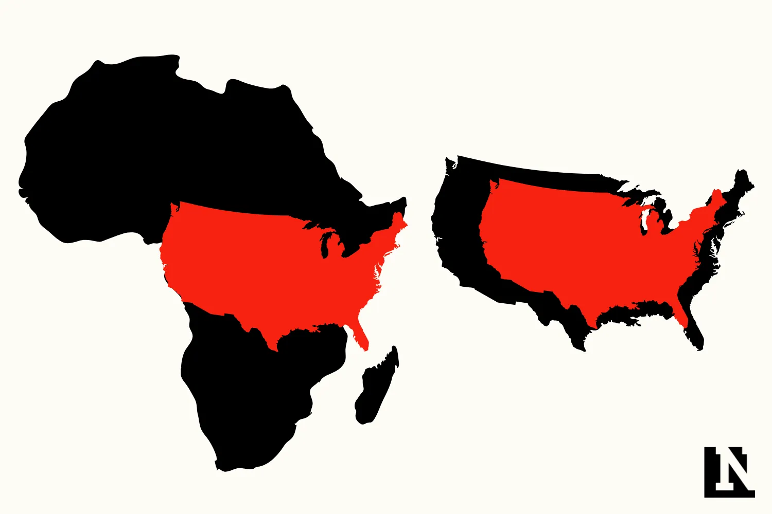
A map highlighting the true size of Africa has gone viral on social media, sparking renewed debate over how world maps can distort people’s understanding of geography.
The post, shared by the account Africa First on X, asked viewers to “explain it to me like I’m 5” while showing Africa compared to other parts of the world using simple distance markers. The image quickly spread, drawing over 2 million views and prompting users to reflect on how they were taught to visualize the world.
Many commenters said the comparison changed how they understood Africa’s scale, with some noting they had long underestimated the continent’s size because of how it appears on commonly used maps.
Read More on Life
Why It Matters
How the world is mapped shapes how people understand geography, power and global relationships.
Africa is the world’s second-largest continent, covering about 30.2 million square kilometers, yet it often appears comparable in size to countries such as the United States or China on standard classroom maps. In reality, Africa is more than three times the size of the United States, which spans about 9.1 million square kilometers.
Viral posts like this one highlight how those visual shortcuts can reinforce misconceptions that often persist well into adulthood.


Why Maps Make Africa Look Smaller
Much of the confusion comes from the Mercator projection, one of the most commonly used map styles in the world.
The Mercator projection was developed in the 16th century to help sailors navigate by preserving direction. To do that on a flat surface, it stretches areas farther from the equator. As a result, regions near the poles—such as Europe, North America and Greenland—appear much larger than they really are, while regions near the equator, including most of Africa, appear smaller.
Africa sits across the equator, meaning it is one of the areas most affected by this distortion. While the Mercator map is useful for navigation, geographers have long noted that it is poorly suited for showing relative land size.
Alternative map projections exist that preserve area more accurately, but they are less familiar to the general public.
Internet Reacts
As the post on X about the size of the continent gained more attention, people shared their reactions.
“You can’t accurately project the surface of a sphere onto a rectangle,” said one commenter. While another wrote: “Can we not make and create our own map that shows what the world actually looks like?”
“The mercator effect is difficult to understand until you have taken a few years of geometry. It is not possible to explain what happened to a 5-year-old,” another said.
View 0 Comments
Submit Correction
View Editorial & AI Guidelines